One of the most important, but least glamorous parts of data science is cleaning up the data, or even more importantly, automatically separating and remediating (if possible) anomalous data. And quite honestly, without a feedback mechanism from the data acquisition system that marks the “data bad”, the problem of finding after-the-fact data collection failures is very similar to detecting solar panel / inverter failures. Here’s a real life example:
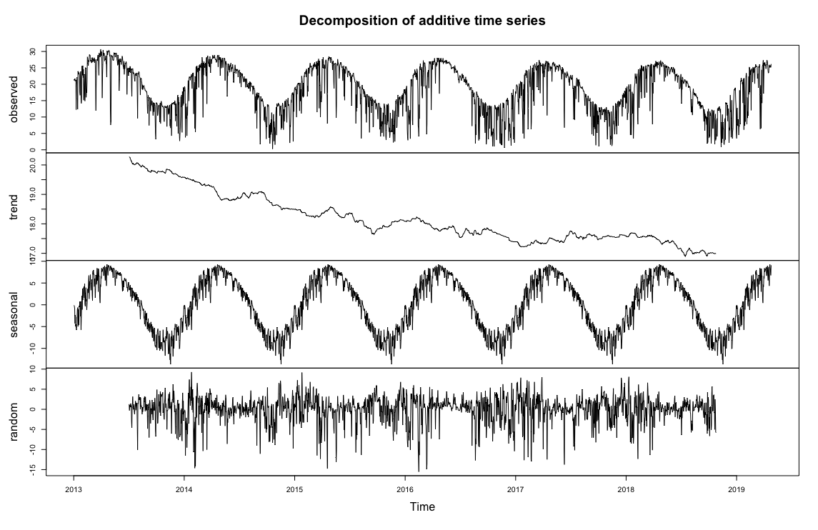
If I go back to my every 15min time series decomposition, it’s easy to spot some clearly anomalous data highlighted in the red boxes below:
- Individual spikes well above the max
- Clusters of spikes well above the max
- Large periods of time where production is zero (we have to remember that at this scale, we’re not even seeing nights of zero production, so these are periods longer than 12 hours.
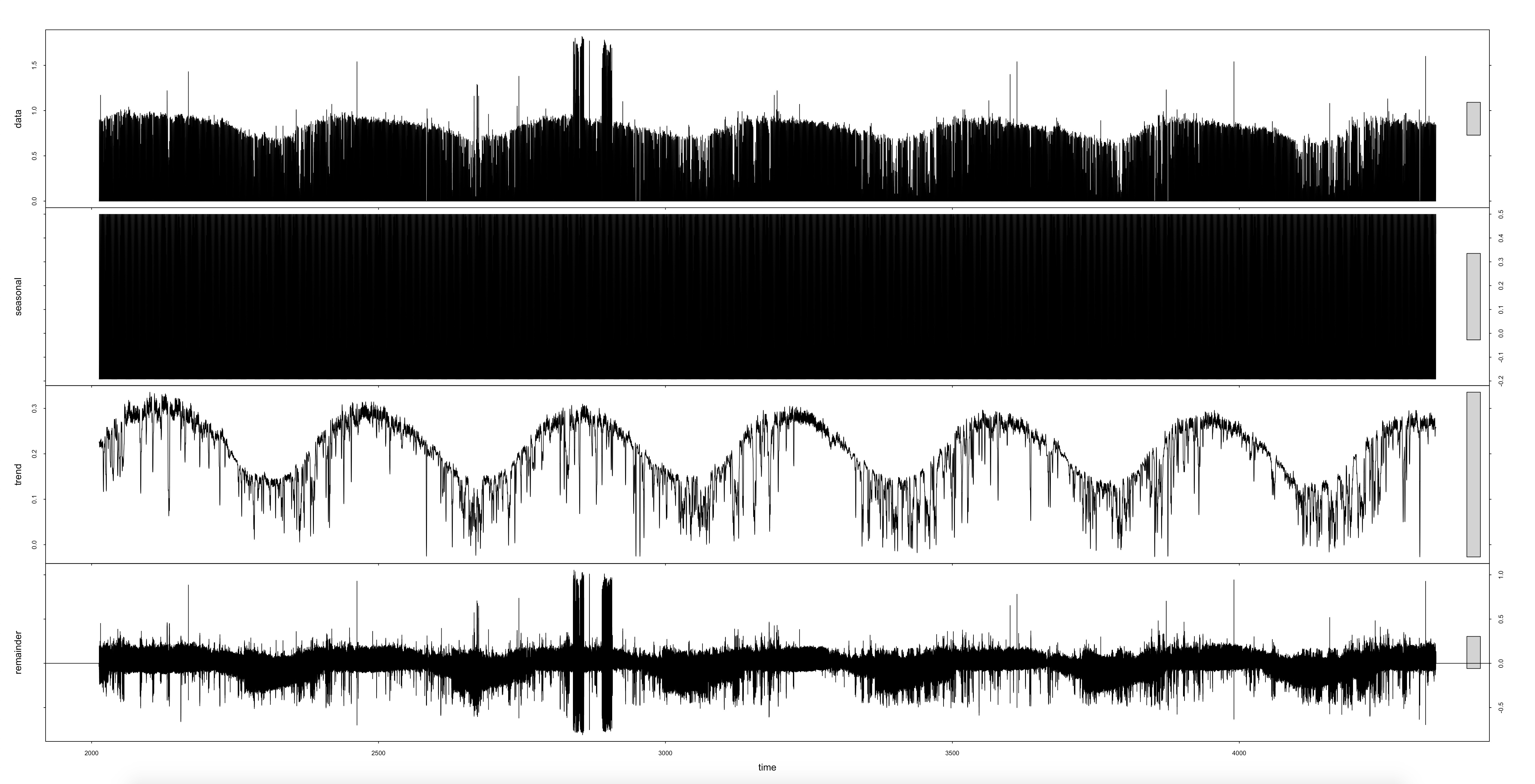
If I zoom closely into one of the spike clusters, I can get a better idea of what is going on. The data collected by SolarCity/Tesla appears to ping back and forth between zero and double the typical amount of energy received in 15 min.
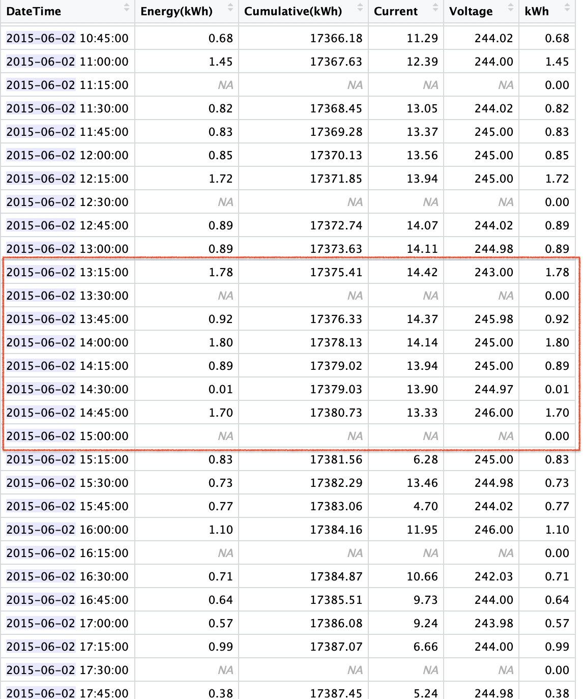
If I look into my SolarCity data for one of those days, I get an even better idea of what is going on. The first 5 columns come directly from the API on the SolarCity website. The rows with the NA’s (Not Available) in those columns are 15 min intervals that were missing from the SolarCity data - I added them so that I could analyze the integrity of my data (BTW - I do the same with my Sense export data because there are indeed missing hours from occasional data dropouts). The 6th column, “kWh” is one I created from my SolarCity “Energy(kWh)” solar production data, except I replaced the NAs with zeros, because some time-series analyses don’t like missing intervals or NAs.
On initial inspection, it looks as if there might have been a data acquisition / networking problem that caused occasional dropouts, and the SolarCity collection compensated by doubling up on the previous data point to compensate in the final total. If it was that simple, I could do an automated fix. Unfortunately, it’s not that simple if I look at the sequence in the red box. The 1.80 reading doesn’t have any adjacent NA row, and it’s unclear if the nearby, but not adjacent 0.01 reading might have been a partial dropout or just a very cloudy 15 min. If any of you guys want to do some forensic pattern checking, I can send you a spreadsheet for the whole months of June 2015.
As for the gaps, I think I have most of them identified. The longest time-series strings of 0 kWh readings all correlate with the missing “dropout” hours that I inserted into the time series, so I at least have control of those points, if I wanted to remediate them, though picking the right value might be more challenging.
Here’s one example: The night of Jun 15th 2015 running into a dropout in the early AM of Jun 2016, running through until the morning of June 17th.