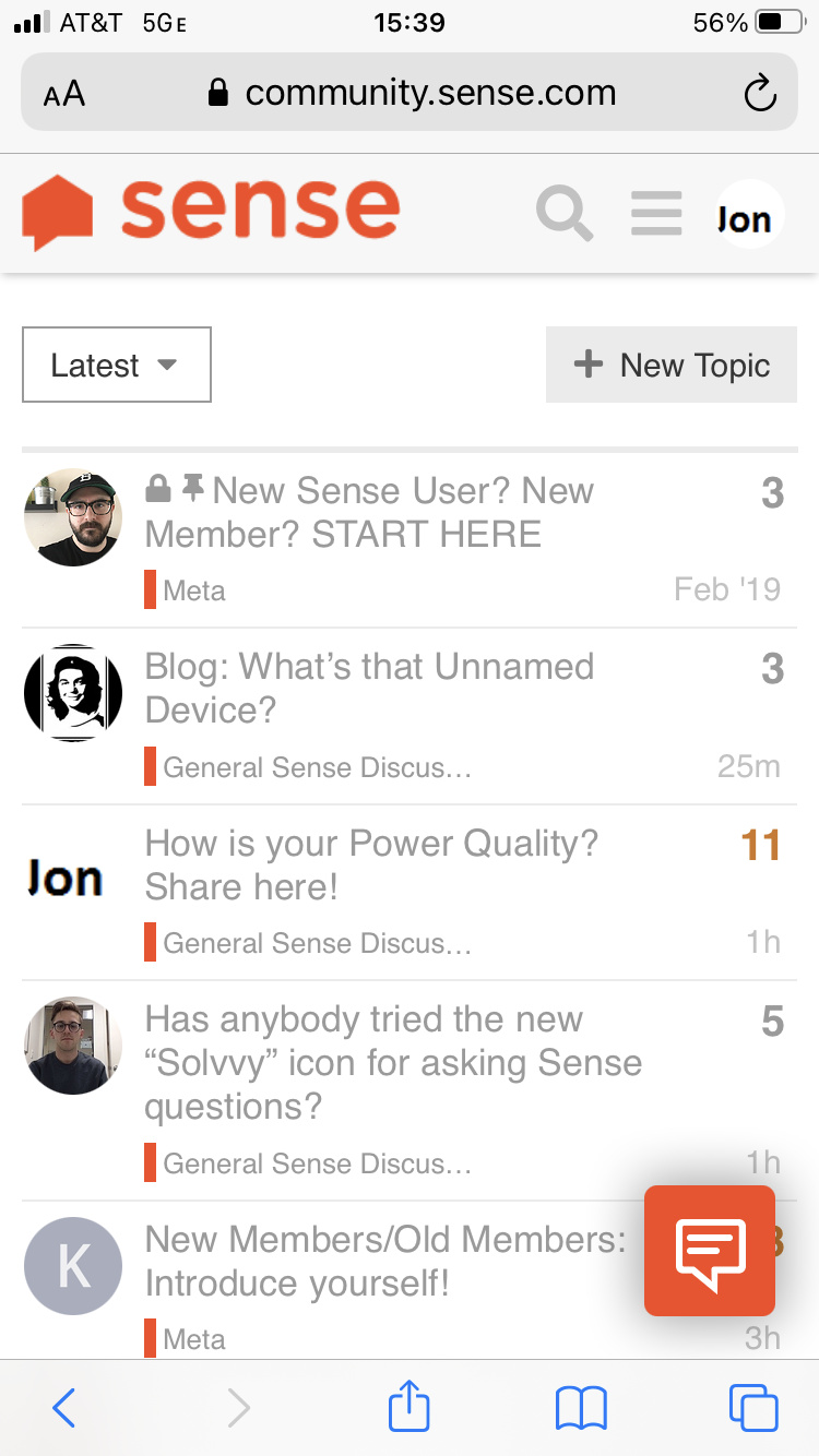
It’s the little icon on the lower right forum that looks like this:

I tried asking it “How does Sense work ?”, and was pleasantly surprised by its ability to point me to good answers. Try it !
It’s the little icon on the lower right forum that looks like this:
I tried asking it “How does Sense work ?”, and was pleasantly surprised by its ability to point me to good answers. Try it !
Can we get rid of it? It looks silly and takes up space on a smartphone screen.
That, I don’t know… Probably a good question for @JustinAtSense.
ps: Solvvy doesn’t give a correct answer for “How do I turn off Solvvy ?”
@jonhawkes You raise a fair point on mobile. I have an iPhone X and it’s not too intrusive on my display, but I welcome feedback and opinion from the Community. The hope was that it would be helpful for new user questions that exist in our current day knowledge base. I’m unaware if users have the ability to toggle Solvvy “off”, but I’ll look into this and see what I can find.
What mobile device and browser are you using?
I use Iphone 8. It takes up a lot of space.
Looking into this, thank you.
@jonhawkes the screenshot is helpful. We’ll see what additional feedback we get here. If I see common sentiment, we can remove this from showing up on mobile. It’s much less intrusive on desktop.
I’ve never seen that icon on any device I have and I actually had to work to get it!
I don’t know if you have access to a content blocker like uBlock Origin in your browser, but you need something similar. I had to disable the blocking and the icon appeared, enabled and GONE!
I would vote for the removal on mobile, and if possible, user selectable on web as well for those of us that don’t want it. I generally dislike these buttons because they are not designed into the page, but plugged in on top, so they end up covering UI elements (as this done when browsing on a phone or a smaller window).
Also, as a long term owner / community member, I’m quite familiar with the help.sense.com articles, so I don’t need to search those. I’m more interested in the unique use case type of questions the community has to offer. Discourse search is decent, but a smarter search would be great. Is there any way to give Solvvy access to the forum posts, rather than just the help.sense.com articles? I feel like that at least clears up why its on these pages. Having two search options on the same page that look at different databases is a little confusing. If the idea is trying to enforce “this is community” vs “official support is over here” I think this doesn’t clarify that and actually confuses it more.
A few thoughts / expansions on trying to clear up its purpose and increase its usefulness -
Can you add a link to The Community under the “Sorry that answer didn’t help” So its not just Rephrase Question and Contact support, but a third option of “Search Community Forum?” - bonus points if you can craft the url into a Disrouce search query passing it the highest score keywords Solvvy identified.
Can you give Sollvy access to the community forum answers so you can leverage the Sollvy AI, but offer up the wider resource of answers and topics of the Community Forum?
Regardless of any of the above - if the button is staying, if it is possible, it would be great if the button could track themes, and you could create an alternate button for the Dark Mode Theme. I think part of why I find it so “offensive” is that now that button is the most present thing on the page. Traditionally that is the idea of these styles of buttons. You want them to stand out, but its part of why I dislike these buttons is that once I see them, when I know I don’t want to use them, they are just sitting there nagging all the time. Its one thing on a website sales page that I only visit once or twice, but it gets old fast on a page I visit daily.
It is still there, but its not yelling at me.
Anyway, sorry if i’m derailing the purpose of this thread. So to actually answer the topic - Yes, I have tried it. I’m not a huge fan in the current implementation.
I agree and am experiencing this. I frequent several HA forums that also use Discourse forum software and use the Discourse iOS app so they are all in one place. Unfortunately Solvvy covers an important UI element for me on my iPhone that prevents me from easily closing the Sense community so I can open another.
We’ve removed Solvvy for mobile users, so it should only be present for desktop/tablet users right now.
Let me know if you’re still seeing this on mobile in the comments and please include the browser and device you’re using.
@ben Both of these require me familiarizing myself a bit more with the Solvvy tool (specifically, if i can add the Community URL to the Solvvy crawler and customize some of the returns there.) I’m going to do a bit of digging and will follow up on this thread later this week.
As long as a resource to the community didn’t return for every question, I really like this idea for some of the non-basic instructional we have content linking to more in-depth explanations and resources within the Community. I have a couple threads saved for quick access that I think would be a good fit as a resource in some relevant help articles. I would want to stress test how good of a job Solvvy does searching the Community, since it’s much larger of a knowledge base than our existing help.sense.com help articles.
Fair point here with Dark Mode. My initial understanding is we had some limited control of the widget, but let me include that in my list of follow-ups for this thread.
Hm, thank you for the heads up. I’m seeing it here as well. I’ll get this resolved by the AM.
Seeing it on android using chrome as well. It covers up important ui. I was going to upload a screenshot, but it’s covering up the button to do so.
When scrolling through a post, it covers up the number in the bottom right showing what comment number you’re on.
@waterboysh @jonhawkes the Solvvy widget will be removed from mobile sometime today. Thanks for letting me know.
It looks like it is now gone from my iPhone.
Solvvy is no longer displaying on the community for users on mobile devices. Please private message me if you’re still seeing this issue.