I’m not trying to be harsh… Actually no, I am trying to be harsh, because I’m fed up watching the quality of this app decline over the years. I’m going to need a product person to explain what they were smoking with the devices redesign on mobile. I have NO idea what the hell I’m looking at here. And before you tell me Sense employees are not on here, they should be.
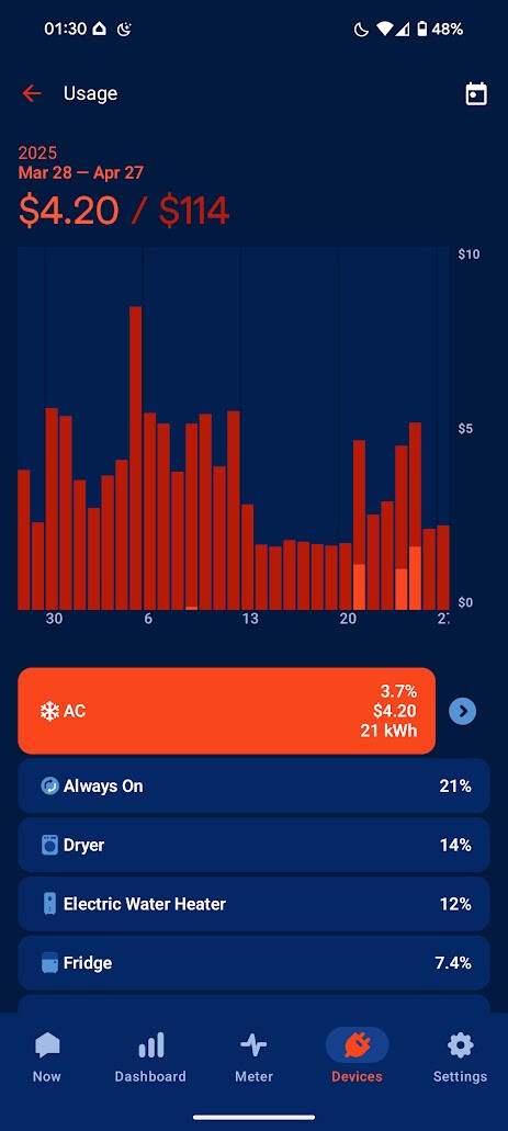
I used my AC for three days in April… 4/21, 4/24, AND 4/25. What is the darker orange measuring? Is it comparing the usage to the same day last month? Last year? Because my AC isn’t on in the end of March/early April so I literally have no idea what this is trying to tell me. Let’s just take random data and display it in the least intuitive way possible
I literally have no idea what all the kwh adding to $114 is because those are NOT the times my AC was running.
It’s as if no one has ever heard of A11Y: Accessibility! What if someone cannot distinguish those very similar colors?
There used to be private betas and feedback requests for upcoming features. They used to listen. I already dislike last year’s redesign of the mobile app because it’s not even a real dark mode.
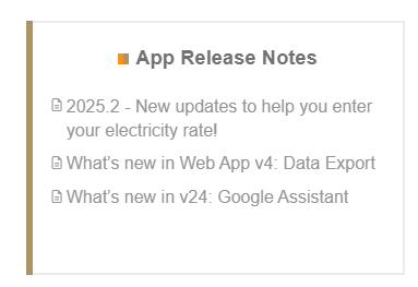
Seriously though remove this section from the forums if it’s not being used. Why have it at all? One update from February and the previous update was from 2023. What’s the point of a release notes section when there have not been any public facing release notes:
EDIT: I figured it out. The price is the total usage for all devices for that selected date range… The darker bars are total usage for that day for all devices. I see what they were going for, but it was not immediately clear to me.
@portfolioso , I think we’re seeing an evolution from Sense being focused on dedicated monitor users (how they started) to a greater focus on “incidental users” who get Sense capabilities via their utility and meter, and on additional cloud apps that help utilities.
Just saw this new utility-level app being marketed in the Australia and possibly the UK.
There’s also new engineering crowd at Sense. Just saw this highlight on their new-ish Director of Engineering for Consumer products. There’s a Connect and Contact button here:
I agree. The focus on the bubble graph on the Now page is a poor user experience. I preferred the optional view that should current solar production, current overall usage, and the delta of sending/receiving from the grid. You need a new UX philosophy and process that takes in user feedback and provides update proposals for feedback. If there is already a beta program for the app, please let me know how to join. Between the new poor user experience and the poor device identification, I am struggling with the value of this solution.
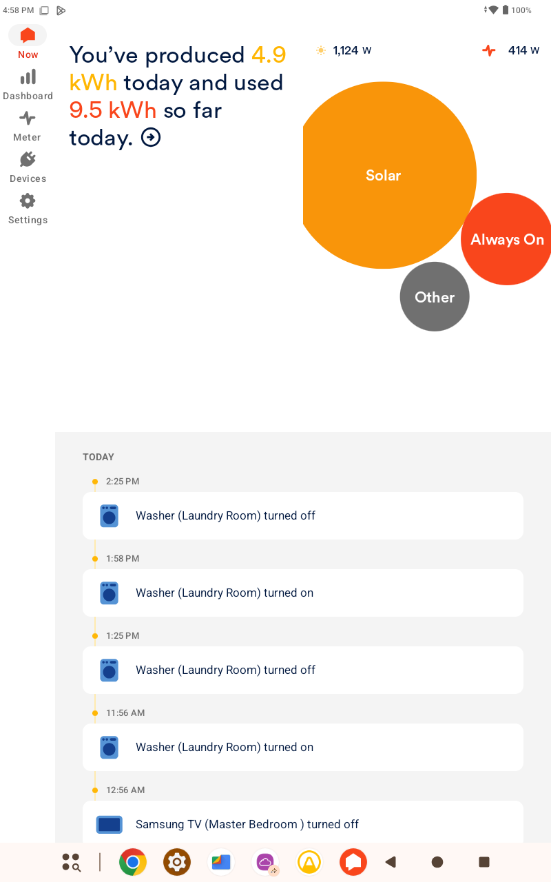
The “Now” Tab on my iPad in Portrait or Landscape leaves me confused, why are we wasting all that real estate in Landscape mode on the iPad and iPhone? I like the new info of “You’ve producted 42 kWh today and used 45 kWh so far, but NOT at the expense of pushing the info from the ‘bubbles’ to side like this. This needs to be redesigned IMO
The Solar production Watts and Consumption Watts used to be ‘transparent’, now they are not, and they block info from the Bubbles on the Now Screen… Can we go back to the old style?
These redesigns are gnarly… Who actually on the UX/product/design teams actually think these look better? I’m all for refreshing the app after all the years, but this new UX is gross.
I use Sense daily to manually monitor my Solar Production vs my Household Consumption in Real Time. I do this to ensure I’m sending as little power back to my Power Company, and to minimize what I do pull from them.
It’s a ‘Game’ of keeping below the solar curve as much as I can by only charging My EV when Solar Production is fully producing enough to do so (as much as I can do so), turning off the A/C while running an countertop electric air fryer oven and/or when running my electric dryer, etc.
While the new UX is far from optimal, I can at least see the two numbers that I utilize everyday.
If Sense is looking to sell more product, this is not going to do it any favors.
I like to show the product to others that have solar, and ‘play it up’ as being better than using the Enphase app that comes with my system.
I’m actually surprised that Sense doesn’t license it’s technology to companies such as Enphase.
I have the same problem with my “cheap” Walmart Onn 10” tablet I use to constantly monitor my Home page. Only about 25% of Home page is devoted to the bubbles (see pasted portrait image). The other 75% is much less useful. Some giant text recently showed up telling me how much I’ve produce for the day, which I’d rather see on a different page or not at all. I can’t drag the timeline out of the way either. The timeline has been a space hog for years on my tablet. Wish there was an option to turn off the display for the “You’ve produced ….” as well as the timeline. All I want to see is the bubbles (with current wattage for each bubble like the web version) and the instantaneous total power produced and used. My Samsung cell phone display is a bit better, but the “You’ve produced…” giant text that recently appeared is still a waste of real estate.
Thanks
So, I guess the question should now be, how long before Sense rights this wrong?
How did this get past any type of Quality Control? Were there actually two people at Sense that looked at this, and thought this was a good idea? I could see this getting put in play by one person perhaps, but more than that… I wonder what the thought process was.
Please sign me up for any new Beta Testing of the app, I’d be more than happy to provide feedback on any new changes.
Add me to the list of those who dislike the new version. I used to enjoy seeing trends, like how much an appliance exposed to the elements uses as the seasons change (in this case, a freezer in our garage) but but that there’s no way to show individual device trends anymore outside of an aggregate view as pictured, the graphical data has become effectively useless.
We have two electric vehicles so our daily/weekly/monthly consumption drowns out everything else and we end up with charts like this for low consumption items. It makes it effectively impossible to see trends now.
Sadly, the recent rounds of updates have made sense less useful.
Being able to find out the number of times an hour, day, week or month has turned on and off is, or should I say was, a very useful stat that has been replaced by a graph showing stats about how much money a device is costing me. Why did anything have to be replaced… ADD features! don’t strip them away.
Give the app another section for stuff like this, please stop replacing features that are actually useful.
I could not agree more, I am so frustrated with this new “Now” look which is very important to me but Now very useless leaving 50% of the screen completely blank!!!
Please sense if you are reading this, revert the NOW page look to where it made logical and common Sense.