Hi All, we want to announce a couple of app updates included in our most recent release earlier this week.
Energy Snapshot notifications update has added a weekly reporting option to existing monthly option. Details here.
We’ve added a toggle function at the recently updated detailed usage reports so that, if you’ve chosen show cost at Settings, you can now toggle between kWh and $ in those views. Details here.
We hope these are helpful to you, and as always appreciate your input if there are unforeseen issues. More to come!
@obscuredtrip , the Always On list in Always On device, display and editing was deprecated in the iOS/Android app a while back. The list is still visible in the Web App, though one can no longer edit. And one really can’t count on long-term as the Web App uses a different endpoint.
What if you don’t like the new interface, can you change it back to an earlier version?
When I open the Sense app on my iPhone 2/3 of the screen is taken up by wording that uses a font that is way to big. It hides details I care for more than the wording.
Nicely said. I appreciate that Sense is trying to put actionable information in front of people, so they are trying out a new way to do that. Yet I hope that they quickly realize that the value of the information they are displaying does not match the size they have given it. A smaller font would be appropriate here.
I checked the app version and it is 2025.13 for the iPhone. It so happened that I have an Android phone that was laying in a drawer that has version 2025.10 installed. I put them site by site and checked some items.
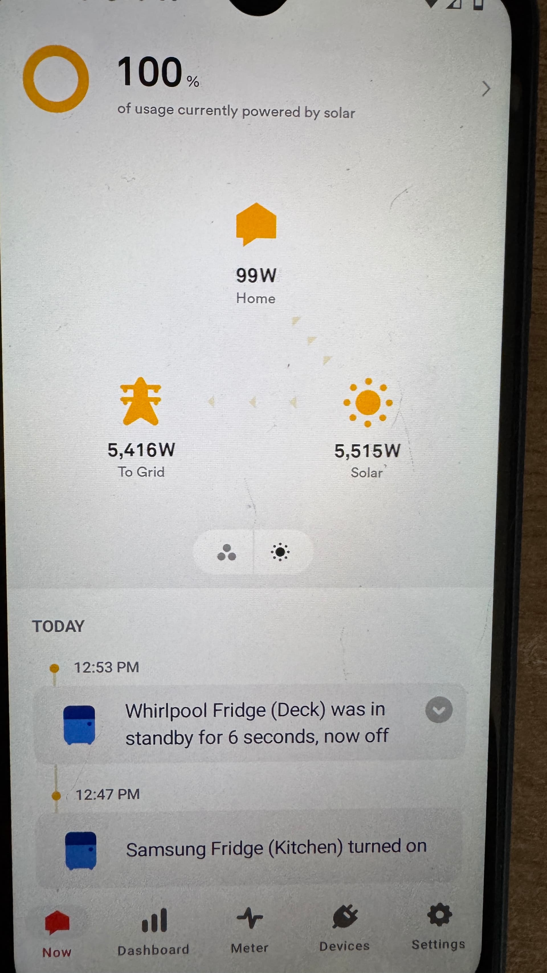
First what happen to the screen that shows your current home use, the solar production and the To grid view, I call that the triangle view? It is removed from version 2025.13.
That was a nice view to show interested people in solar, in real time, what you produce and sent back to the grid.
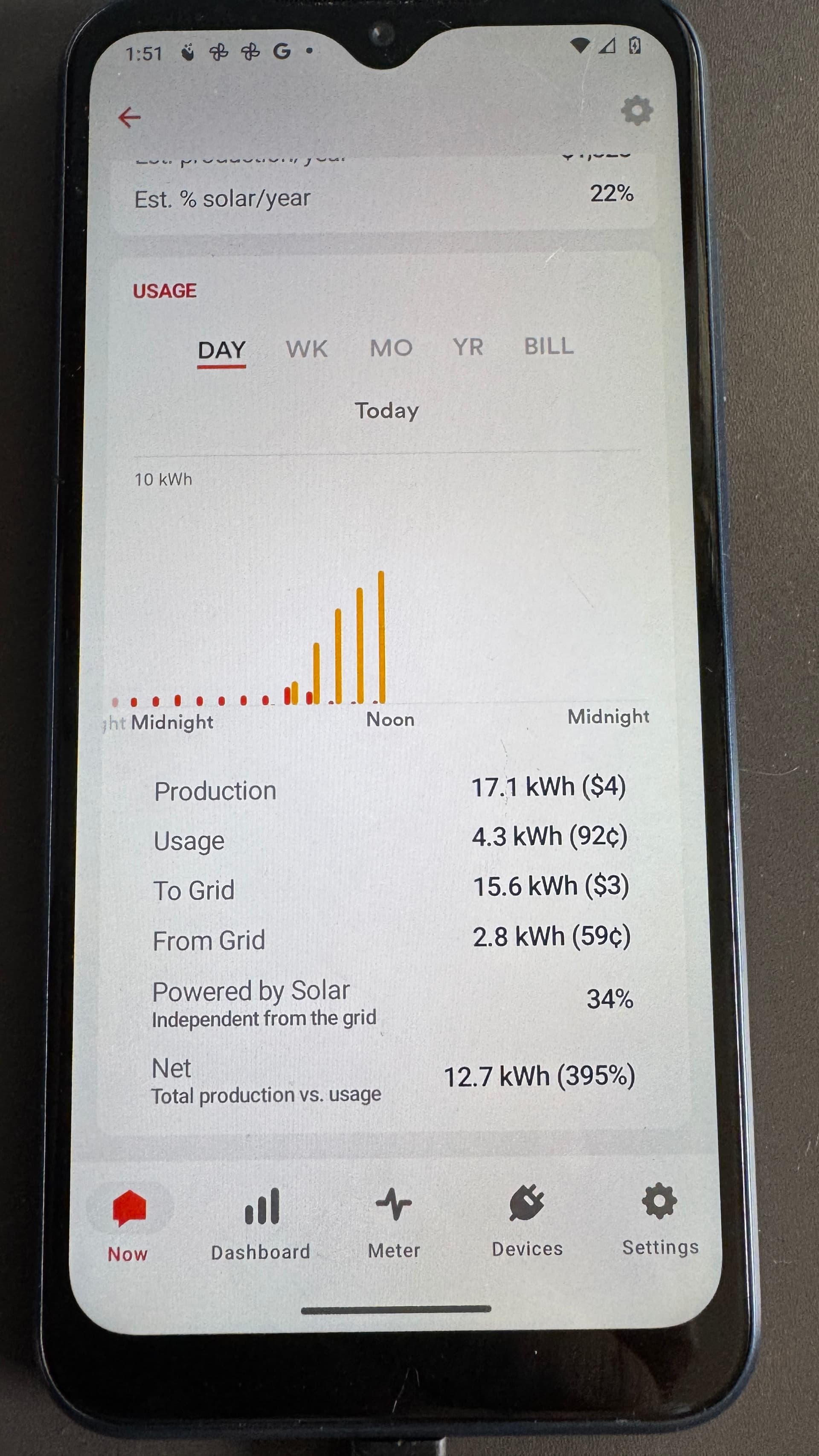
Also the stats are different now, my Android shows 17.1kwh production vs 22.5kwh on the iPhone. I like the higher number of production but is it accurate?
So I asked ChatGPT if you restored the iPhone from an backup can you get the older Sense app back on your phone. The answer is no, it will not roll back an app to its older version.
When you restore your phone or iPad it will redownload apps from the App Store in their current version.
I hope we can get more users to chime in and tell Sense they dislike the redesign and hopefully get “old features” restored.
The developer of the app should be busy fixing bugs like your system is off line then introducing a new look.
@rverwij , on your solar data, it looks like you have one extra hour of production on the iPhone. Given the time is the same between both of them, I would surmise that the new build of software uses an endpoint that updates hourly aggregations faster than the endpoint used by the older software. That is somewhat confirmed when I look at my iPhone vs the web app. My iPhone solar updates are an hour ahead of the web app updates. Seems like Sense built a new endpoint for a newer, simplified incarnation of the app.
Hi – I hear your feedback and we are looking into your concerns. I’ll keep you updated as I get info I can share.
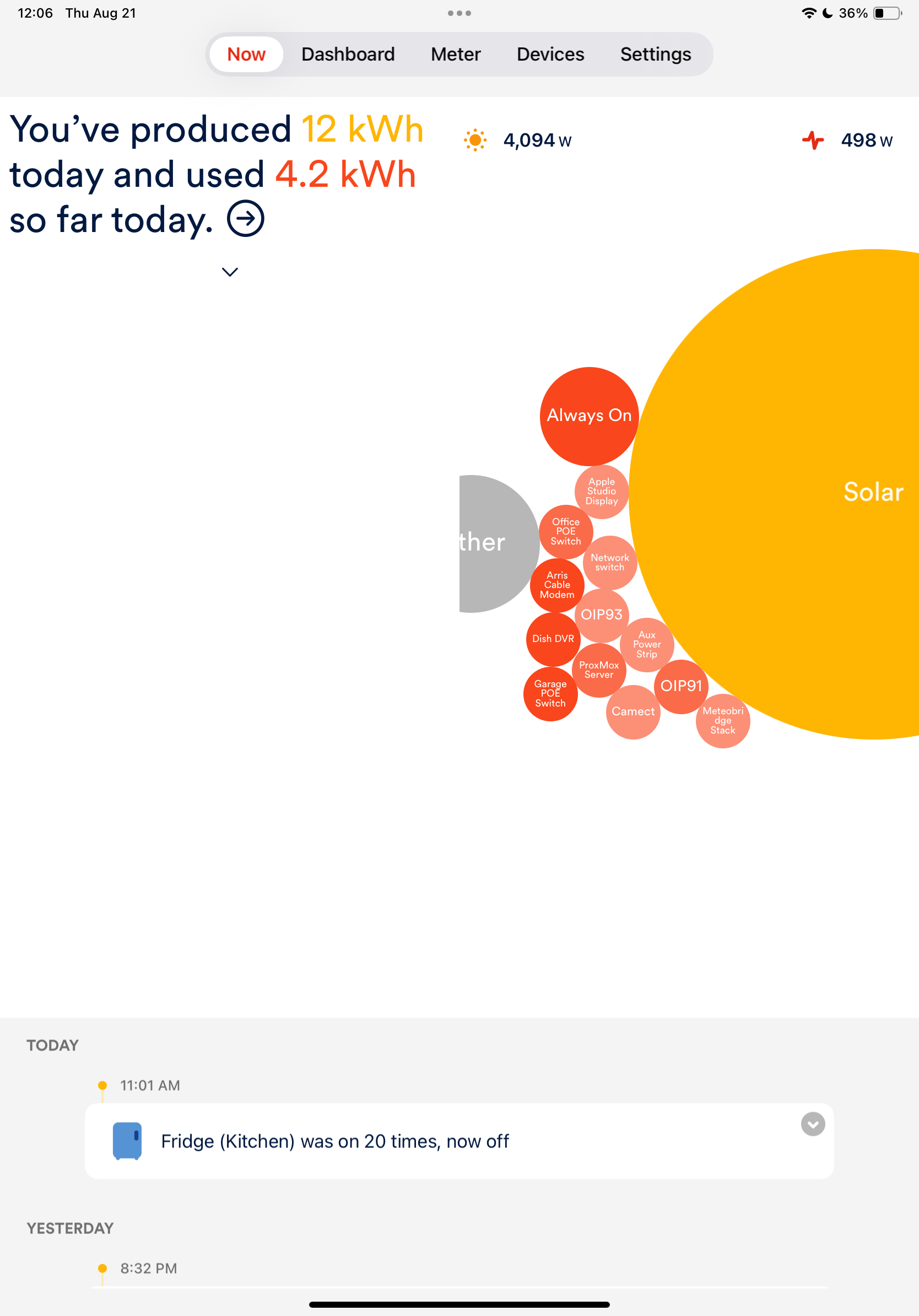
To clarify a few things – we replaced the triangle view with the “Now” screen dashboard card to give immediate insights into usage.
The empty space issue on the Now screen on the iPad has been reported as a bug.
If you have solar, I can see how the screen takes up a lot of space – visually, it makes more sense if you just have usage and not solar. This has been brought to the right folks’ attention.
The rest of the questions Kevin has done a great job answering, though if you see any inconsistencies let me know.
That text that now blocks 1/4 of the bubble space is entirely too large and it’s not that useful information for me. Please provide an option to disable this message at least.
Also the “triangle view” provided very useful power flow information especially how much is being presently imported/exported to the grid and that is a critical number. Otherwise we have to mentally subtract solar from current usage an on ongoing basis.
This latest update was very discouraging because it provided low-value obstructive text and removed an important information panel that’s been there since day 1 of sense.
Totally agree with James and others. The triangle view was the most useful view for me as a solar owner. One quick look at that view and I knew when to turn on high usage devices (dryer, EV Charger) and not pull power from the grid. Please bring it back!! Also agree that the new large font text portion of the screen is distracting and not very useful.
There is a serious lack of product management and QA to let this pass, even a a feature proposal. Letting this escape unto the wild is a huge finger in the air to customers!
Concur … “triangle view” was very useful and informative. The data/text that now appears Now tab is of little value to this user. Please restore the “triangle view” or at least make it a display option.
I hear you. I’ve shared your feedback with the design team, and they are aware of this. Since the removal was intentional, I can’t say if this feature will return, but I truly appreciate your feedback.
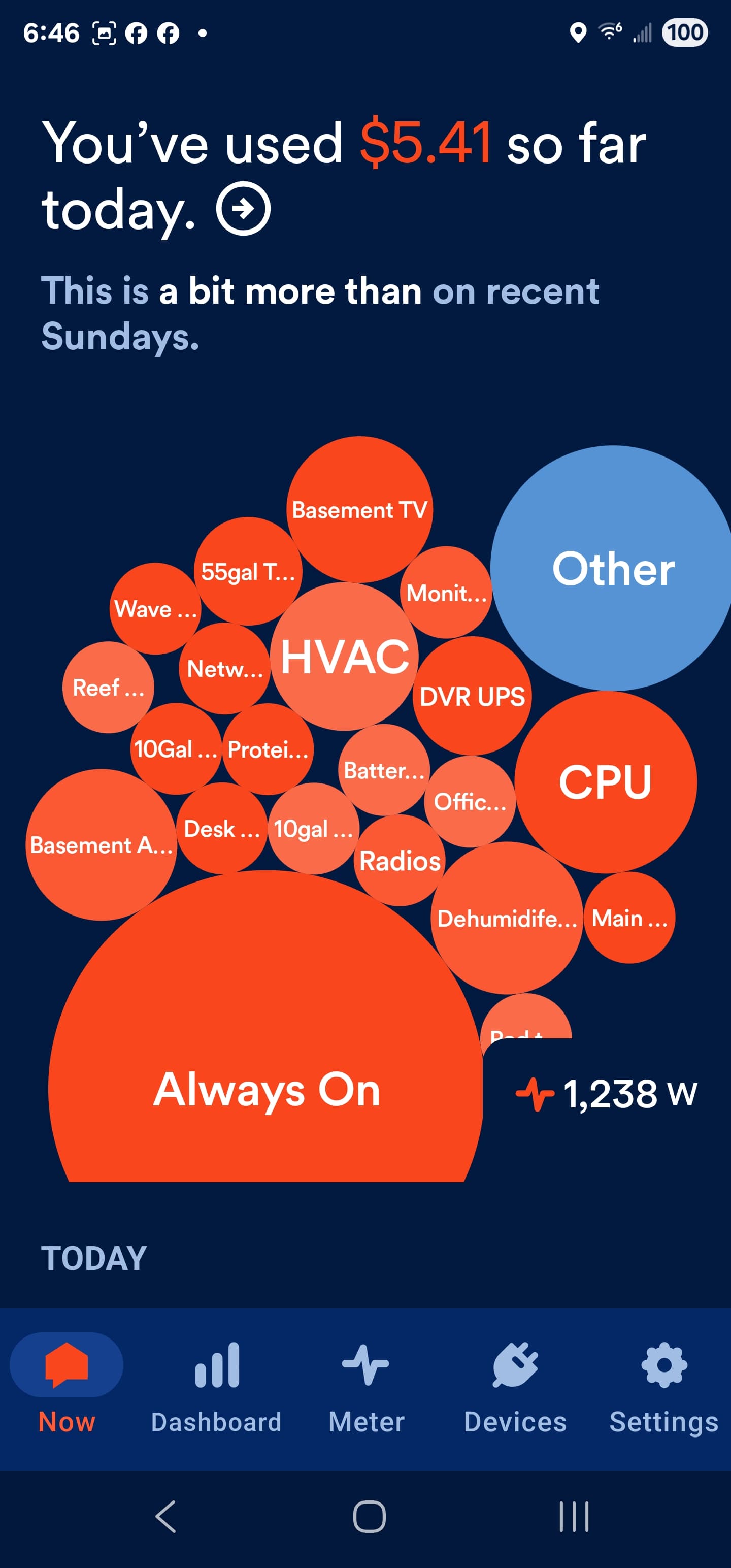
I really do like knowing the “You’ve used” & “recent” display, it’s just far to overwhelming, especially in landscape.
At least add a way to ‘X’ it closed.
It also appears that something was changed making the bubbles very hard to resize and move. Two finger pinch is much much more difficult then before as well as playing ‘bubble pong’. Can anyone else confirm?