
see attached photos.
I’m confused about what the callout is reporting here - it indicates a change of -2169w, but the graph indicates a change of (2641w-6849w) = -42018w?
see attached photos.
I’m confused about what the callout is reporting here - it indicates a change of -2169w, but the graph indicates a change of (2641w-6849w) = -42018w?
Was there supposed to be a screen snap of the bubble screen? I just see two timelines there.
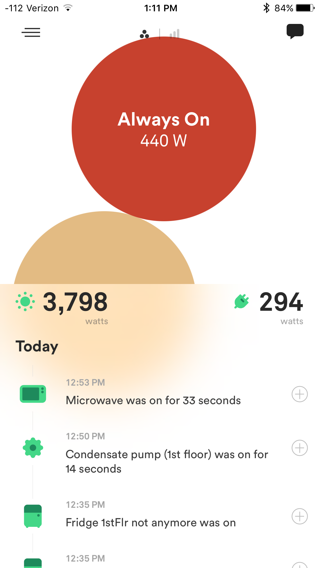
Looks like Sense is wrong again and things are getting worse. Just a few minutes ago my always on bubble showed 440 watts while the total shows only 294 watts and this was fairly steady.
Matt, to clarify a bit, the change that we show in the callout is trying to find a change in a single device (the one with the biggest change in the time window). So, it needs to sort out a change of a single device versus multiple devices happening to turn on or off at about the same time. You can’t see it in the scale of the graph here, but our guess is that there were two changes in a short time span and we are just reporting one of them. This could have been two different devices turning off at the same time, but more likely in this case one device which turned off in two steps (we see this sort of behavior in some devices). We agree that we should be able to do a better job of with this (and make it a better match to what you see in the display). Thanks for your feedback on this issue – we’ll add it to our list of things to work on!
Hi Howard, what is happening here is that the “always on” is actually an estimate of the always on power over the last 24 hours. We don’t really have a good way to track this in real-time, so we need to use this longer-term estimate. And, this estimate does need to handle occasional dips which go below this (these can happen for a variety of reasons). We’ve been aware that this can sometimes result in reporting current power below the always on estimate. The two solutions we’ve thought of would be to either make it more clear that “always on” is a longer-term estimate, or we could artificially lower our always on estimate (at least temporarily) when we see real-time wattage below this. Let us know what you think! We’ll be doing some new work on the always on estimate soon!
In my view, for this device to be worth anything at all, the total power consumption number should match up with what the CTs are actually seeing at any moment. That is the only hard piece of data we really have and that should be reported accurately. I rather see the error included in always on or unknown. Thus I would think the bubbles should at any given time add up to what the total is actually showing. Thus in my graph I would want to see the individual bubbles add up to the 294 that is showing as the total consumption at that moment.
Sounds like it’s logistically difficult to actually pin real time numbers on always on data. I can understand and accept why you’d have to display the average here, although I do agree with Howard that in the bubble window it would be confusing. I tend to think of the bubbles as an entertaining (neato!) display, while the real time graph is what carries the meaningful data.
A̶̷r̶̷e̶̷ ̶̷a̶̷l̶̷l̶̷ ̶̷t̶̷h̶̷e̶̷ ̶̷b̶̷u̶̷b̶̷b̶̷l̶̷e̶̷s̶̷ ̶̷a̶̷ ̶̷d̶̷a̶̷i̶̷l̶̷y̶̷ ̶̷a̶̷v̶̷e̶̷r̶̷a̶̷g̶̷e̶̷,̶̷ ̶̷t̶̷h̶̷e̶̷n̶̷?̶̷ ̶̷O̶̷r̶̷ ̶̷j̶̷u̶̷s̶̷t̶̷ ̶̷a̶̷l̶̷w̶̷a̶̷y̶̷s̶̷ ̶̷o̶̷n̶̷?̶̷ Edit - I know the answer to this, I think.
Thanks for your detailed reply! I think that you are correct about this being a single device. This change was a result of me flipping the circuit breaker on the hot water heater. It’s a heat-pump unit so I’m guessing that there are at least two internal components being shut-off - (1) the pump and (2) the heating coils. This is a device that I really want Sense to eventually identify (it is currently “unknown”), hopefully the multiple internal components can be recognized as one meta device.
I like to look at the bubbles for relative usage, but I don’t ever really look at the numbers. I’m not sure they need to completely reconcile back to the usage graph (just look at the usage graph if you want to see real-time usage). The bubbles give me some idea of “what” is using “how much” in a relative manner. That being said, it’s interesting to consider that Always On is just an average of the day. That really implies that it will never be an accurate measurement (and thus misleading in graphs and usage). I would expect the sum of all bubbles to “never” equal the real-time usage values then (can that be right?)
Would it be possible to just not display the “Always On” … and coincidentally, is the “Unknown” a similar thing? (is that one also an average of the day, or can sense some how distinguish between always on and unknown?). I think if I had enough devices detected (we’re still a ways away from that), seeing Unknown and Always On as bubbles should be something I can toggle off. They have far less meaning if they don’t display accurate data, and since I want to see what is using relatively the most amount of energy, excluding them might give a better picture. When we only have 2 bubbles though, it’s hard to exclude them.
Just my 2 cents.
Taking your toggle idea to the next step I would like to be able to go into the device list (also having it include total and solar) and be able to toggle any and all items on or off and then let all the graphs contain only the items that I want to see at any given point in time. This is particularly important for those of us that have solar which dwarfs the line and bar graphs at time. If I want to see how much my fridge uses hour by hour in the bar graphs all I see it a tiny line for each bar for the fridge as the autoscale is set to huge to account for solar production.